Creating a Brand Style Guide for your company
It’s important to keep all marketing materials aligned within your brand strategy when presented to the public. Any visual communication piece that includes the use of logos, colours, fonts and photos should be accumulated into a book or document. A Brand Style Guide contains a set of rules and serves as a guide for the designer on how every element should be used to create perfect marketing materials that are aligned with your brand strategy.
Brand style guide outlines the brand’s goal and company philosophy. In reality, your designer or creative agency that work with you may come and go, but your brand’s message needs to remain the same. The advantage of having a Brand Style Guide is that you can work with different people but still have the same kind of appeal for your branding.
How is a basic Brand Style Guide should look like?
Every style guide can be different depending on how complex the brand is. Some companies have a very detailed style guide which includes their messaging, copywriting guidelines and icons for web purposes. In this article, I will show you how to create a very basic style guide.
Fonts:
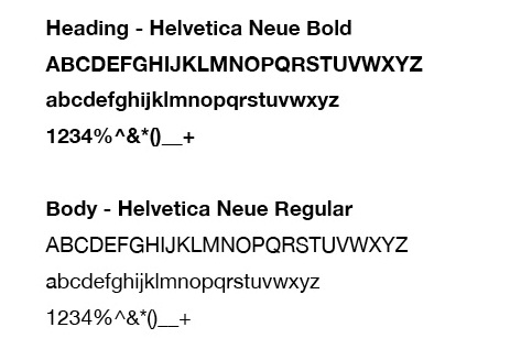
There is a diverse selection of fonts but you only need to choose a few that reflect your brand identity. Once your designer has suggested what fonts are best for your brand, you can then set a rule for what sort of treatment is required for the heading, body etc.
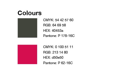
Colours:
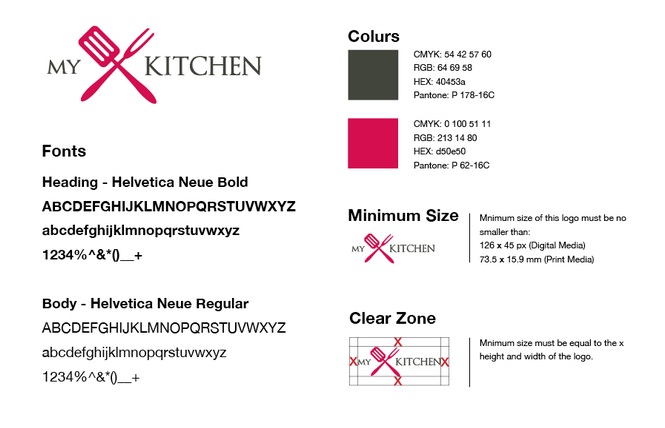
Your logo may be used on digital and print materials. Having specific details for each designated colour will ensure that your company has a consistent colour motif throughout their branding, therefore it’s important that you have the right information for CMYK or Pantone colour (print media) and RGB or HEX (digital media).
Logo Size and Placement:
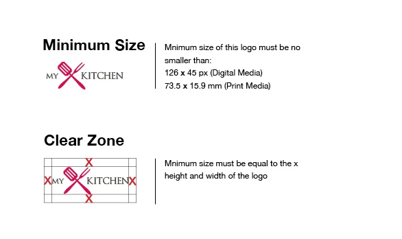
You don’t want your logo to be too small and/or unclear therefore setting a minimum font size can ensure that people can still see your logo. Every logo has a different shape and style so establishing size minimum depends on the designer’s preference.
Also, it’s important that your logo is not distracted by other graphical elements that surrounds it so setting a clear zone is an effective way to avoid this issue. If you see below, I used a lower-case x as the tool to set the minimum clear space for the logo which means that there should be no other graphics allowed to distract the logo.
These examples are some of the most basic in terms of building a Brand Style Guide. By incorporating all of these steps into your branding appropriately, the complete product will look eventually look like this:


